Friday, July 31, 2015

Under The Sea

Hi everyone can you believe that August is here. Once again a heatwave has begun so after running errands I holed up in my playroom and did crafting. I was happy when I saw that the challenge this week for Stampotique is the theme "under the sea".  From the time I first saw the ocean when I was eight the ocean has been my happy place. Even when I can't be there in person I go there in my mind.

To join in the challenge or to view all the wonderful inspiration please click on the badge on the left hand side.  You don't have to use Stampotique stamps in order to join in the fun. You can use any rubber or clear stamp. :-)

Since the deadline is not here yet I'm also going to enter this in the "No Ordinary Paper" challenge over at Simon Says Stamping . I went back and reread the rules and I can enter more than one project. :-)

Without further ado here is my under the sea creation.
This was a fun card to make it was also a learning experience. I learned you can creamate adhesive cork if you cut it cork side up. I also learned that colors appear differently air brushed on the cork than on card stock.

I first cut out my card base using Kraft card stock. I was going to cover the whole card base with the cork but cremated it with my first cut so I had to cut it down a little narrower. Luckily cutting it with the lined side up it ended up being a clean cut. The adhesive cork is by DCWV. I bought it on sale as I thought it would give an interesting texture to projects. I took a seashell stencil and used my Ebrush air brushing machine with Spectrum Noir markers.

My underwater background was an experiment to see what Brusho Color Crystals would do on wet photo paper. I bought a lot of water resistant photo paper at a dollar store several years ago just so I could play with  them in crafting. I misted my photo paper and then sprinkled turquoise crystals over the wet paper. Then I took my mister and spritzed the paper to help the crystals dissolve more. I love the resulting pattern.

Over the photo paper is scrap from a page protector which I ran through my eBosser embossing machine with a couple of different stencils. I then used a sponge roller with Liquitex Iridescent Medium. I rolled on a very thin coat as I wanted just a hint of the iridescent but didn't want to hide the background of the photo paper. After that was dry I randomly placed drops of Dimensional Magic in some of the de-bossed circles.

Not being sure if running the plastic through my Xyron Adhesive machine would smash the bubbles or not I stapled it to the photo background. I decided I didn't like the staples showing so the die cuts hide those.  The greenery is cut using Spellbinders Sprig Corners die set. I modified by tearing pieces off after they were cut out of scrap paper. The fishes  were cut using the patterns in the ScanNCut machine using parts of a couple of gelli prints.

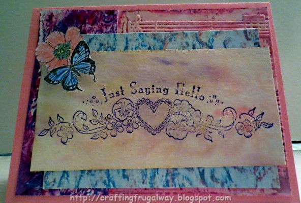
After stamping my sentiment on a piece of non stick parchment paper which I had used for my air brushing and other things I decided to cut off all but the happy place of the sentiment.  Sometimes I don't like to use all of a stamped image..

Have you done any projects using adhesive back cork?  Do you like to use stencils in your projects? If so do you have any favorite stencils that you find yourself using over and over.

Wishing you Happy Frugal Crafting till we meet again!

Wednesday, July 29, 2015

Page Protector And Corrugated Cardboard Card

Hi everyone hope all is going well with you. Another week and another Mojo Monday Sketch. Also I saw on a blog that Simon Says Monday Challenge is no ordinary paper so I decided to combine the two challenges and make a card. The Mojo Monday Sketch this week is making a tall and skinny card using the sketch. I think I'm a liking making tall and skinny cardss. Here is this week's sketch.
I decided to substitute the circle with a butterfly. Otherwise I tried to stick fairly close to the sketch. I had so much fun making this card. As well as playing and experimenting seeing what things work and what don't. Here again this sketch is a great way to use up those scraps.

Drum roll please! Here is my card and I love how it turned out using plastic, corrugated cardboard and paint samples.


I started out by making my card base using a scrap of page protector. Then I was going to use a paint chip for the background but realized that the back was going to show inside. Opps! So if you are going to make a card base out of plastic keep that in mind. I ended up using for the background a leftover scrap from my Brusho Color Crystal and Perfect Pearls Mist experiment. It is amazing how both sides of the paper look different.

(Inside the card. I may add embellishments when I get ready to finish the inside.)

My blue panel on the card is believe it or not a paint chip from Glidden. Glidden makes good size paint chips which are great to use in crafting. I do find that if I cut the paint chip down that I need to ink the edges.

Playing with corrugated cardboard was loads of fun. Who knew you could mix metallic paints with window cleaner and use in an air brush or mister bottle. Just make sure you clean either the parts of the mister bottle or the parts of your air brush good immediately. After the paint was dry I used a stencil with aqua gelato and misted with left over diy Brusho color mist to soften the stenciling. The corrugated cardboard did separate from the backing but now I have striped paper for another project. ;-)

My sentiment was stamped with Stazon ink on a scrap of my oil pastel/orange cleaner paper. I'm a saver of narrow pieces when I cut a piece down because you never know when they may come in handy. ;-)

I bought Glitter Deco Fabric markers to use with my airbrush but have not been happy with them. After I discovered that Brusho Color Crystals was not going to work with this particular stamp I decided to see if the marker would work with the stamp. I wish you could see the glitter on the butterfly. The butterfly is stamped on another paint  chip.

I thought the cardboard looked naked so added some flower beads I've been hoarding. I also got out my Xyron Creative Station to use for adhering the background to the plastic. I quit using it because I thought the cartridges were too expensive but after finishing off another tape cartridge in my tape runner I'm starting to rethink things.

What no ordinary paper have you used in your projects? Have you tried making your own color mists? If so what did you use to make your color mists? If you haven't made your own color mists what brand of color mists do you find yourself using?

Since the cleaning fairy has been partying and from the looks of things the partying has been happening while I've been away I need to spend some time cleaning. Wishing you Happy Frugal Crafting till we meet again!


Saturday, July 25, 2015

Minion Pull Tab Birthday Card

Hi everyone hope life is treating you well. July is getting away from me and  I almost forgot my son's birthday. I have been fascinated by the Minions ever since I saw the first movie of them. My granddaughters love them also so dad may have to hide his card. I also love interactive cards. It took me some thought about how to put the card together. I love how the card turned out. Of course you know me I had to do experimenting. O.k I know you are anxious to see the card.
 I used a blue marker with my air brush for the border on the card base. I decided after I made my card base that the white was too stark yet I like having a white inside to stamp or write on.

I noticed that Stampotique this week has a challenge stamping a background using household type things. I decided to see what I could do using crumpled foil and bubble wrap and instead of using ink using Brusho Color Crystals. After I did my stamping I thought the background needed a little bit of softening so went ahead and spritzed water over my stamped background. This not only softened the edges but also toned down the colors since Brusho is bright, vibrant colors.

The cake is a Silhouette Store file. I think it came with my Cameo. I mixed Brusho with texture medium for the cake frosting. I used fabric paint on the candle,flame,candle-holder, and cake trim. I would have used the same fabric paint on the trim but it was really globby paint as was the clear glitter one. I do think it gives the candle more of a melting wax look. Of course this morning I discovered that I have blue Scribble 3D paint but didn't want to cut out trim again and wait for the paint to dry. The top of the cake is glow in the dark glitter and that is the only glitter I have which I thought looks like sugar sprinkled on top. The cake is adhered only on three sides creating a pocket and leaving the top open
The pull tab is airbrushed to match the border and then I wrote pull on it. I positioned my print and cut Minion so only the Happy Birthday would show until he was pulled up. If you put a search in for Minion Clipart you can find all kinds of it. :-) You can't really tell in the photo but I used Dimensional Magic for the glasses.

If you haven't made pocket pull tab cards I encourage you to do so. They are tons of fun to make and the possibilities are endless for what you can use as a pocket. Also I encourage you to play and see what backgrounds you can come up with using different household items.

I've been listening to the rain dance against the window while posting this and once in awhile glanced out the window to watch the raindrops bounce off the plant leaves like they were on a trampoline. We need the rain so no complaints.

Wishing you Happy Frugal Crafting till we meet again!

Wednesday, July 22, 2015

Mojo Monday 407

Hi everyone as promised I would be doing a Mojo Monday card. I had a few wonderful days in the mountain although I can't really say that the weather was that much cooler. I also got to visit with a good friend's mom who is like my other mom who is in rehabilitation.

To be honest the sketch for this week was a real challenge for me. Not because of the sketch itself but because I just couldn't get things to look right. I ended up taking off the doily I had used and some pleated ribbon as I didn't like it. Of course in the process the card stock tore but the ribbon  all the way across covers that up. :-) It also covers the chunk out of the bottom pattern paper as that was a scrap.

Here is the sketch for this week:

Here is what I came up with. After making modifications and ending up having to use clear Zots to put the stamped acetate on the card I like it. Of course because the clear Zots  showed I had to add some bling. Also another challenge for this week is using Stickles and or Liquid Pearls. As my friend Beth knows I only have two bottles of Stickles. Lol! .only two bottles of Liquid Pearls also. For some reason with all the other things I have in my stash those two products are not high priority to buy. Without further ado here is my card for this week.
I did not notice in the sketch that the two panels were not as wide as the card base so I don't have a border. Of course I already explained about the ribbon going clear across.  As I said I did not like how the doily looked so I went with a flourish instead. It echos the flourish I think in the bottom pattern piece.

The papers used are from the Mariposa card stack which I'm ashamed to say I've had for a few years now but seldom use. The bottom paper was a scrap and I tried to cut it as high as I could without the chunk cut out of it showing on the final card. That dictated the height of the all over butterfly piece. 
Alas you can't see it in the photo but the all over butterfly card has beautiful gold embossing on it.

The blue panel is Brusho Color Crystals sprinkled on a piece of scrap card stock and then the Siphon adapter used with my airbrush filled with a mixture of window cleaner and Perfect Pearls. I discovered that the Perfect Pearls mixes better using the window cleaner instead of water. Using water the adapter clogged. :-( I wish I could have captured with my camera the gorgeousness of the panel. 


Both the scallop circles at the top right and the flourish on the left was cut out of scrap card stock using my electric cutting machine. Then Stickles applied.


The stamp used here is by Cloud 9. I have had the set for a few years but have only used a couple of the stamps in the set. :-( I stamped on acetate using Jet Black Stazon Ink. I was afraid of messing up stamping directly but I wanted the background to show through. The glue I tried to apply the plastic with although it appeared to hold the plastic when wet did not when it dried. I was out of glue I usually use for gluing plastic to card stock. It was the small Zots to the rescue. Only thing I don't like is that although they ae clear they do show. :-( Gems from my stash and the circles covered where the dots were used. Because the adhesive on the gems is not that good I also used the Zots to adhere those.

There you have my Mojo Monday card for this week.  If you are a stamper have you ever stamped on plastic? If you haven't I encourage you to try it sometime. You do have to use a ink like Stazon.  I have been known to color using markers on the backside of the stamped image. You can get a nice stain glass look that way.

I encourage you to join in on the Mojo Monday fun. It is fun to see what you can do and a great way to start your week. http://mojomonday.blogspot.com/

I make no promises but I'll see if I can make a video using the Brusho Color Crystals and posting here. Until we meet again wishing you Happy Frugal Crafting!


Tuesday, July 14, 2015

Mojo Monday 406

Hi everyone another week another Mojo Monday sketch. This one was a fun one as I was able to look through my pieces of my experiment papers. I only wished that I had written in pencil on the back how I did some of the experiments. The more recent ones like I used for this card I know how I did them. There are others though that I've looked at and really like but am totally clueless how I did them.

First off before I do the unveiling of my card I want to invite you to join in on the Mojo Monday challenges. Not only are the challenges fun but each sketch can be a good lesson in design. I find myself looking at the sketches and thinking what makes this sketch so pleasing to the eye.. Flutter on over to http://mojomonday.blogspot.com and feast your eyes not only on the inspirational sketches but also on the gorgeous examples the design team create each week.

Here is this week's sketch:

Here is my take on this week's sketch:
The panel on the left was done using the technique that I did a tutorial for on this blog. The panel on the left is embossed using a Darice embossing folder. I air brushed with pink  markers and a blender pen  The blue panel was my experiment using oil pastels and Awesome Orange for a water color look. For a personal challenge I did not have water soluble oil pastels or water soluble crayons so this was my solution.I rubbed oil pastels over my embossed panel which had a piece of card stock on the raised side. I then brushed the orange cleaner over my embossed card stock.  The sentiment panel was a "Happy Accident". I was playing with spraying Awesome Orange cleaner on a piece I had scribbled  oil pastels over. The scribbled card stock was on a piece of non-stick parchment paper which I had been using to catch the over-spray from my air brush.

The sentiment is a stamp by Hero Arts but I'm pretty sure it has been retired by now. I've only had it for a couple of decades ;-).  Normally I would have colored in but I decided to leave it uncolored as there is plenty already going on.

The butterfly on the flower is a Dover image. After printing it out  with a laser printer I used the ScanNCut machine to cut it out. I decided to not use the stem and leaves after it was cut out. Alas the machine would not recogonize the image so I ended up cutting those off by hand. I then colored with pencils. I wish I could have gotten a better picture as this ended up being a totally gorgeous embellishment. I then heated up my laminator  and foiled with Opal DecoFoil by Therm O Web. I am going to have to buy more of this foil. Just wish it came in the economy pack like some of the other colors. Because it is more transparent then the other colors the printed lines show through.

There you have it my entry for this week's Mojo Monday. I'm not sure when I'll be posting again but do come back as I plan to create a card for next week's Mojo Monday. :-) Until then wishing you Happy Frugal Crafting till we meet again!

Sunday, July 12, 2015

Dance To Your Own Music Mojo Monday Sketch

Hi everyone I was scrambling today to finish another card using this week's Mojo Monday sketch before the deadline at 8  this evening mountain time. I think I'm going to make it. To refresh your memory this is what the sketch is:
Once again I made the top piece narrower but I didn't want to hide all of the embossed panel. That is my story and I'm sticking to it.  Here is my card and I love how it turned out.
My ballerina was not printed on a scrap but the rest of this card is from scraps. Of course now I have another scrap of white card stock which is a good thing since I use it all the time. The foil pattern card stock  is by DCWV it was part of their Black Currant pad. I love this card stock. Alas Cameron my Cameo did not and instead of cutting like he was suppose to he made slashes in it. :-( Since I was layering I knew I could use it as the layers covers up his naughtiness. 

Yes the other side of the embossed card stock was a print job which went wrong. I inked up the Darice embossing folder and misted it with water before running the card stock through my embossing machine. Alas when I took it out of the machine I didn't like how it looked. I took my air brash and markers and colored it. I don't know who makes the music stamp or what set the sentiment came from.  I decided to go with a piece of ribbon for the diagonal piece. The piano keys is clipart from Dover Performing Arts Clipart book. I found the book at a used book store and thought it might come in handy. The ballerina is also by Dover. I used my Spellbinder die to cut her out.

Although the contest will be over do come and check out the sketches at Mojo Monday. As well as check out the wonderful inspiration by the Mojo Monday design team. http://mojomonday.blogspot.com/ Tomorrow there will be a new sketch challenge. I can't wait to see what it is. :-)

The weather is cooler so I'm off to take a long walk with my dogs. Wishing you Happy Frugal Crafting till we meet again! 

Saturday, July 11, 2015

Serenity Prayer Card

Hi everyone before I get too far into this post I'm asking prayers for Heidi Swapp a well known paper crafter and business woman. Through the years she has shared her scrapbook pages featuring her family.Thursday her second oldest son Corey unexpectedly died. I can't even begin to imagine what she is going through right now. I just know how devastated I would be if my son was to die. Please keep her and her family in your prayers.

Yesterday was Friday and that means that a new sketch was released for the Viva La Verve sketch challenge. Since my vacation is actually not as soon as I thought it was I decided to join in. This sketch was a challenge for me only because I wanted to use the Serenity Prayer stamp which is part of a set released in June.  Without further ado here is the sketch and you can join in the fun here:
http://vlvsketches.blogspot.com/
I don't really do bows but I think I did alright. Here is my card:
I haven't decided if I like this card or not. But I think it is growing on me.  Lol! Of course it seems that some of the cards I'm not totally thrilled about others love. The card base is the other piece of card stock from making a card base. I love that I can get two card bases from one piece of letter size card stock. My doily was printed on copy paper but all the rest of the card is done with scraps.

Yes, I have a ton of white card stock scraps from doing print and cuts. As well as save card stock where stamping or printing didn't turn out and use the other side. I was playing with gelatos and a stencil on a scrap of white card stock. I didn't like the way it turned out but being the frugal crafter I am I decided to use it for this card. I figured the colors in the panel would tie in with the colors of the butterflies. I decided it is best when using gelatos with stencils to use stencils with large areas. So I didn't really waste time playing as it was a learning experience.

I have tons of black paper which were inside page protectors. I use the page protectors for different things so always have the black insert leftover.. Originally I was going to use a white panel or to airbrush one but then I decided to see how black would work.

I love my Kaleidoscope Kreator but don't use it nearly enough to pay for it. I only have the basic package so don't have a lot of shapes to use.  I decided to use the lacy circle. The image I used is one that years ago I converted to a mosaic image playing around. Because it would take too much work I decided to just have my cutting machine cut out the shape after it was printed.  I actually think it looks better with that touch of white.

I scanned in a template for my tags. Originally I was going to have both tags cut from plastic. However I found a scrap of the pinkish card stock. Lol! It is actually textured on one side but on that side there is etched a shape which didn't cut through using my cutter. Did I mention I'm a frugal crafter. After stamping the Serenity Prayer I was able to arrange it where I wanted it on the screen using the Brother's ScanNCut. I love my Cameo but some things like getting a stamped sentiment where I want it is so much easier with the ScanNCut. OK I didn't get it exactly where I wanted. I ended up having to adhere it to a cut out plastic tag. I didn't think about the space needed for a hole for the ribbon. Argh! Then I didn't like the ribbon and ripped the hole taking it out. So it was back to the drawing board to come up with a way to salvage my tag.

I've tried making bows using just about every technique I've seen. I even tried with a bow making machine. Alas I suck at it. However, I really wanted a bow on this card and didn't like any of the ribbons I tried color wise, etc. Then I spied my roll of raffia ribbon  next to my regular ribbons. Lol! After looking at this picture I rearranged the bow so it is now neater but I'm too lazy to take another photo. The bow looked naked so I played around with gems and pearls. I finally went with the pearl. I never would have thought of placing a bow upside down but in this case it doesn't interfere with the sentiment. I also love the way the ribbon tails flare out.

Finally got rain after a long dry hot spell. It looks like the rain has stopped so time to take my dogs on a long walk. I'm trying to walk at least two miles a day. Lol! Of course the other day I had to travel to the city to walk in an air conditioned place.

Have a awesome weekend and wishing you Happy Frugal Crafting till we meet again!

Thursday, July 9, 2015

Mojo Monday 405

Hi everyone another week and another Mojo Monday challenge. I thought this was an interesting sketch to try my hand at.  Alas I messed up cutting my embossed panel and so it is narrower than I wanted but still I think I stayed pretty close to following the sketch. This is another great sketch to use those scraps. I did have to cut from a full sheet my card base as I don't have any scraps big enough anymore to cut for an A 2 card. The netting I bought on clearance yesterday otherwise I used scraps and things from my stash.
Here is the sketch:
And here is my take on it:
I cut my scraps to size and then took a scrap of white card stock to emboss. I bought a frame to use with embossing folders but it didn't totally work right.  Still I did have a flat place for stamping. The embossing folder is by Darice. Oh the shame while putting embossing folders in an organizer I found some folders which never had been used and this is one of them.  Since a personal challengenthis week is to use gelatos I played. I scribbled two different metallic ge/latos on my embossed piece. Then sprayed with water and used a foam brush to move the liquid gelato around. A simple technique but I think stunning results using metallic gelatos. The sentiment is from Verve's Sparkly dream set. It was the case of finding the sentiment which worked the best size wise. I cut the netting down to size to fit the card stock. I used gel glue since it dries clear to adhere the netting. I had the flower petal in my stash so instead of cutting out circles I went with that. The petals were previously used as a mask with my homemade glimmer mist. The circle was in my stash and I colored with gelatos. The butterfly element is a sticker from Dollar Tree. I love these bubble stickers.

I encourage you to join in this challenge and this one you ave the chance to win Verve stamps. Go to http://mojomonday.blogspot.com for more details.

O.k. that is all for now. I'm getting ready to go on vacation but may do some crafting before I leave. Do come back because you never know what I'm up with. In the meantime wishing you Happy Frugal Crafting till we meet again!


Monday, July 6, 2015

Lady In Blue Mixed Media Card Challenge

Hi everyone here it is July and that means a new mixed media card challenge over at http://themixedmediacardchallenge.blogspot.com This month the theme is blue with the use of a vase optional. I opted out of using a vase as it just would not go with what I wanted to do. I have a lot of different images with blue in them but I keep going back to a Dover image that I love of a lady in blue. My cards lately have had at least one stamp used on them but when I found the hi bubble in my Studio library I decided to go with that instead of stamping hi in a speech bubble. Drum roll please!

This is a tall and skinny card since I had originally cut out the card base to use for a tall and skinny challenge but changed my mind.  Since this will fit in a standard business envelope there is no extra postage required. :-)

The background is from a piece of scrap. I think it is the paper I have for painting acrylic paint on. I was experimenting and sprinkled turquoise Brusho on the paper and then brushed with a foam brush acrylic wax over. It left a colored background with speckles in it. Then noticing the pattern in the outfit I decided to roll metallic blue paint over the background. I didn't get crisp lines in some places but I think I like the shabby, messy look. Although my perfectionist side is fighting with me and saying turn the paper over and use the other side. So do you think I made the right decision letting my messy side out or should I have listened to the perfectionist?

Next we have a tag which was airbrushed with a left over liquid I have no idea what it was. ( I really need to label my leftover mediums in bottles.)I think it was tube water color paint which I thinned with water when playing with the Siphon adapter. Anyway it looked blue in the container but ended up being turquoise when sprayed. I went ahead and sprayed my sewing pattern piece also and discovered when I dried it with my embossing gun that it developed a nice crinkly texture.  In person the tag is more turquoise than it shows in the picture.

I took my lady and in Studio changed the cutting lines to black as well as changed the thickness. Then made sure I had checked to print cut lines in the software. I went ahead and also did an offset of the lady and did the same thing with the cutting lines. My machine cut off part of the line on the right of the offset but I like the shadow effect that ended up.  I think that by having the cutting lines print that it helped the image to pop more.  And it is definitely a lot more neater than if I had tried to outline by hand.The lady's foot is glued down and the rest of her is pop dotted with foam adhesive squares.

For the speech bubble I filled in the background with blue. Changed the color of cut lines and thickened the cut line a little bit and made sure the word Hi was set to not cut out. Originally I was going to foil the word hi but I decided to leave it white with the black border.

To finish off the card since it is suppose to be mixed media I added a piece of rick rack once again bought at a thrift store for a dime. I really need to go back to that thrift store and see what other sewing notions they might have which I can use for paper crafting. I like the bit of texture and interest that things like rick rack gives and in this case it echos the pattern in her outfit.

I don't really have a lot of blue things in my stash. I never on purpose buy blue card stock and the only reason I have blue paint is it either came in a set or like my Sapphire metallic paint I bought it at a thrift store. For some reason when I'm looking at bottles of paint in a store I don't think to buy blue unless it is teal or turquoise. Of course while working on this card I realized I'm going to have to buy blue Brusho Crystals. ;-) Do you have a lot of blue things in your stash?

Today is Monday and so that means a new Mojo Monday sketch. I've already looked at it and am excited to use it in a card so I'm off to create and to think about what I'm going to do after going through the scrap bin.

Stay cool if you are where it is hot and wishing you Happy Frugal Crafting till we meet again!

Saturday, July 4, 2015

Viva La Verve First July Sketch Challenge

Hi everyone here it is the celebration of the 239th anniversary of Independence Day and what am I doing but crafting and writing this post. Hopefully by evening it will have cooled down so I can go and watch the "boom bangs" as my son used to call fireworks. In the meantime I do not do well out in triple digit temperatures. Alas of course since it is a holiday weekend the AC decided to go South on me. Still it is cooler in my apartment than outside.

Once again I'll be entering my card in two different challenges. Over at Stamponique the challenge is to use ribbon and since this card has ribbon on it  I might as well. ;-) Like usual the current challenge can always be found here: http://stampotiquedesignerschallenge.blogspot.com The other challenge is as the title says Viva La Verve Sketch challenge and info about the challenge can be found here:http://vlvsketches.blogspot.com I just love this sketch even though I goofed and placed my sentiment panel too low and was afraid of ruining things by taking it off and placing it up higher. Because of this my circle ended up lower on the card than in the sketch.
Before I show you my card I want to show you what the left panel on the card looks like. On Thursday I received in the mail Brusho Color Crystals from across the pond and of course had to play with them yesterday. I decided to see what would happen if I used acrylic floor wax instead of water with them using water color paper.  You know me I don't like to waste anything so when I saw the puddle of wax with the colors on my parchment paper I decided to mop the liquid up with a scrap of water color paper before throwing the parchment paper in the trash. Because the non-stick parchment paper wrinkles when it gets wet I got a really neat pattern. I love how the floor wax gave this a shiny finish. I'm going to have to remember and use it on other pieces where I want a shine. Especially since it dries quicker than some other mediums.


One of my goals this year is to use scraps and bits and pieces. I had yellow card stock left over from a print and cut and it was large enough to make my card base. I then saw the decorative scissors on my work space and decided I need to use them more often so edged the top and bottom with them

The left panel is what is in the photo above. The right panel is cut from a piece of scrap. One thing about doing a sketch like this you can maybe pare down your scraps. The rectangle shapes on the left are also scraps. I was especially pleased to find a small piece of shimmery lavender card stock for this card.

Both the butterfly and the sentiment are from Verve's Sparkly Dream stamp set. After stamping the sentiment I traced over the word Sparkle with my Sakura Clear Star pen.

After I cut out the border I used the adapter for my airbrush which allows me to spray liquids. I wanted to see if Brusho mixed with water would work with it. Now I can save money by not having to buy expensive color mists. Although I only have five colors of Brusho I can make my own custom colors. :-) Of course I had to brush Iridescent Medium over the border for shimmer and sparkle. You know in my past life I was a magpie so I'm attracted to shiny things. ;-) When borders have openings like this one I love to weave ribbon through them. I bought this ribbon on sale and use it a lot but it  is like it regenerates on the spool as I never seem to run out of it. :-)

The scallop circle is cut out of a gelli print which I wasn't really thrilled how it turned out but I discovered the prints can look different when cut into shapes. It doesn't show in the photo but turquoise metallic paint is in the print. I discovered though that metallic paints dry too quick so need to have extender added to it when print making.

I am so in love with this butterfly stamp.  There was a scrap of black paper on my desk and I decided to see about stamping on the black. It seems like so often I stamp on white card stock. I used white embossing ink and then an off brand turquoise embossing powder my sister gave me as she didn't like that it doesn't really flow when you heat it up.  I love the pebbly textures.. Of course as you can see on the card photo I had to paint Iridescent Medium also over the butterfly.

Even though I had goofed with placement I love how this card turned out and will be using this sketch  at a later date again.

If you live in the U.S. I hope you had a happy and safe 4th. Wishing you Happy Frugal Crafting till we meet again!

Thursday, July 2, 2015

Home Sweet Home

Hi everyone looks like the hot weather is here to stay so I will be either cleaning,organizing, or crafting. I still have not gotten to a store to buy spray paint for my old toolbox nor have I started on my inspiration board.

I have enjoyed doing sketches but thought it would be fun to do something else. A friend wanted to use the clipboard which the house and card base were in so decided to make a card. Originally I was going to use a window stamp and have a face looking out the window. However I used the face on something else and when the Home Sweet Home banner was offered as a free file by Silhouette I decided I wanted to go with that. I decided to forgo using the window with shutters stamp.

Drum roll please!

 The sky was airbrushed on the card base.  The sun was stamped on a scrap and then cut out by hand. I used my airbrush with stencils for the roof and the bricks. The window was cut out of a scrap. The lace in the window is some I bought over thirty years ago when a fabric store was closing. I have no idea how many yards was on the card board but it was a lot.

The scallop awning cut out of another scrap and airbrushed and then colored over with a blender pen to give a faded weather look. The flag is free clip art which I did a print and cut. If you put American flag in search you can find all kinds of free clipart. I adhered the bottom of the staff down and then used adhesive foam to lift the flag up. The butterfly is a stamp I've had for decades. I recently found it again when I was sorting and  purging my stamps.  I was playing with Brusho Color Crystals which came in the mail today to color the butterfly. It didn't come out like I had planned but I do like that the stamp lines show through. I did go ahead and use Iridescent Medium on top. I used foam adhesive to lift the butterfly off the card.
I took the banner file from Silhouette and turned on print cutting lines in the Studio software. I then printed in with my laser printer on yellow card stock. I think I should have cut it out first before doing my foiling as the cut part was not perfect. I used DecoFoil rose gold foil.

I hope the couple I'm sending this card to will like it. They just moved into a new home. He is a veteran who flew the flag at their old place so I thought he would enjoy seeing a flag.

If you are where it is hot stay cool! For those who live in the U.S Happy 4th of July! Wishing you Happy Frugal Crafting till we meet again!


Wednesday, July 1, 2015

Mojo Monday 404

Hi everyone can you believe it is already July and it is already Wednesday. This week's Mojo Monday sketch challenge was a challenge for me. I've never done a tall and skinny  card before and I sort of messed up the layout proportion wise. :-( I switched the vertical and horizontal layout in the sketch because I couldn't bear to cover up my pretty engraved metal panel. I also used a cloud instead of a circle for the same reason. Here is the sketch:
Here is what I came up with:
After cutting out my card base I changed my mind and decided to go with the white. Now I have a tall and skinny color cardbase for another card ;-)

I decided instead of using card stock for the vertical paper to use some wide wire ribbon that gathers dust in my stash. After playing with sheer and other ribbons I settled for the green gold edged one. I also decided to use the green gem ribbon that I picked up in a clearance bin at Michael's for a dollar. Because the ribbon frays really bad on the open side I used laser tape I picked up at Dollar Tree to cover the raw edge. On the fold side the ribbon goes around to the back.

I was playing with a scrap of Tim Holtz metal and my Scan N Cut. I tried the setting I read on a blog  but it didn't cut all the way through. It almost did so I just need to use more pressure next time if I want to cut a shape out. I love how the design has an engraved look to it. I rubbed black shoe polish over the metal and rubbed off except what was in the grooves. I then took my air brush and a Spectrum Noir marker and air brushed the background.  I did not know if I could use a Sharpie to color the design since there was some of the background marker on the design. Coloring with a Spectrum Noir marker the design without sealing the metal first did not work but it did work using a Sharpie. I discovered that you do have to seal this as I had the ink scratch off before I sealed it. Good thing that an alcohol wipe allowed me to start all over again. ;-) Since I own stock in alcohol wipes I decided to experiment with the sealer. I dropped matte GlazOn right onto the metal and took a foam roller and rolled over the metal. I love the resulting texture. In my experimenting I discovered that you definitely have to seal between colors or you will have a huge mess. I have only tried GlazOn so I don't know  what other sealers might work.

Using a stamp from the Verve's Sparkly Dreams set I stamped on non-stick parchment with StazOn ink. I then took some Patina Perfect Pearls and sprinkled it on a piece of foil because that is what I had handy and misted it. with water.  I then placed my sentiment in the liquid. If you decide to color  baking parchment this way it will curl so you need to get both sides of the parchment wet. After it dried I took the stamp and laid it over my stamping and with a black Sharpie drew around the stamp. Then I loaded it into the Scan N Cut and let the machine do the cutting for me. I then picked the cloud design in the Scan N Cut library and cut my cloud out of yellow gold paper. You can't really see the sparkle of the gold in the photo. I thought of cutting out a sun for the sentiment to go on but I thought it would cover too much of my etched metal.

The jury is still out on this card but at least I did some experimenting and using things in my stash that I usually don't use. Also I got the chance to familiarize myself a little bit with the  Scan N Cut and the online software. I think I should get an E for effort. What do you think?

If you decide to make a tall and skinny card which fits inside a business envelope you will cut your card stock 6 x 7 and score at the 3.50 which if my math is correct is half of 7, ;-)

Be sure and check out http://mojomonday.blogspot.com and challenge yourself. Or at least find some  awesome inspiration. The Mojo Monday team really rocks with the inspiration they come up with every week.

Wishing you Happy Frugal Crafting till we meet again!